Animated Lettering tattoo with AI
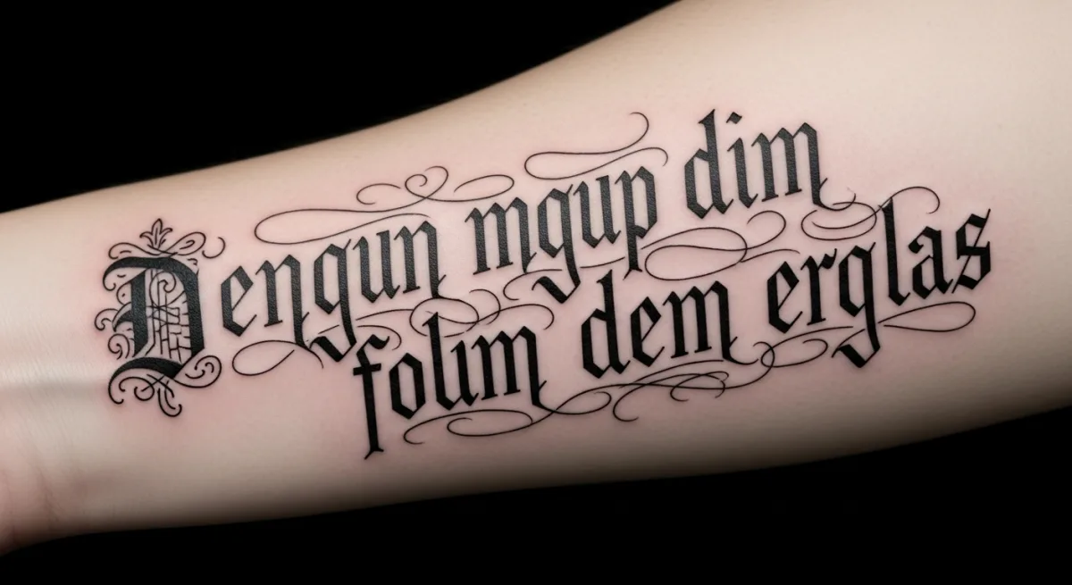
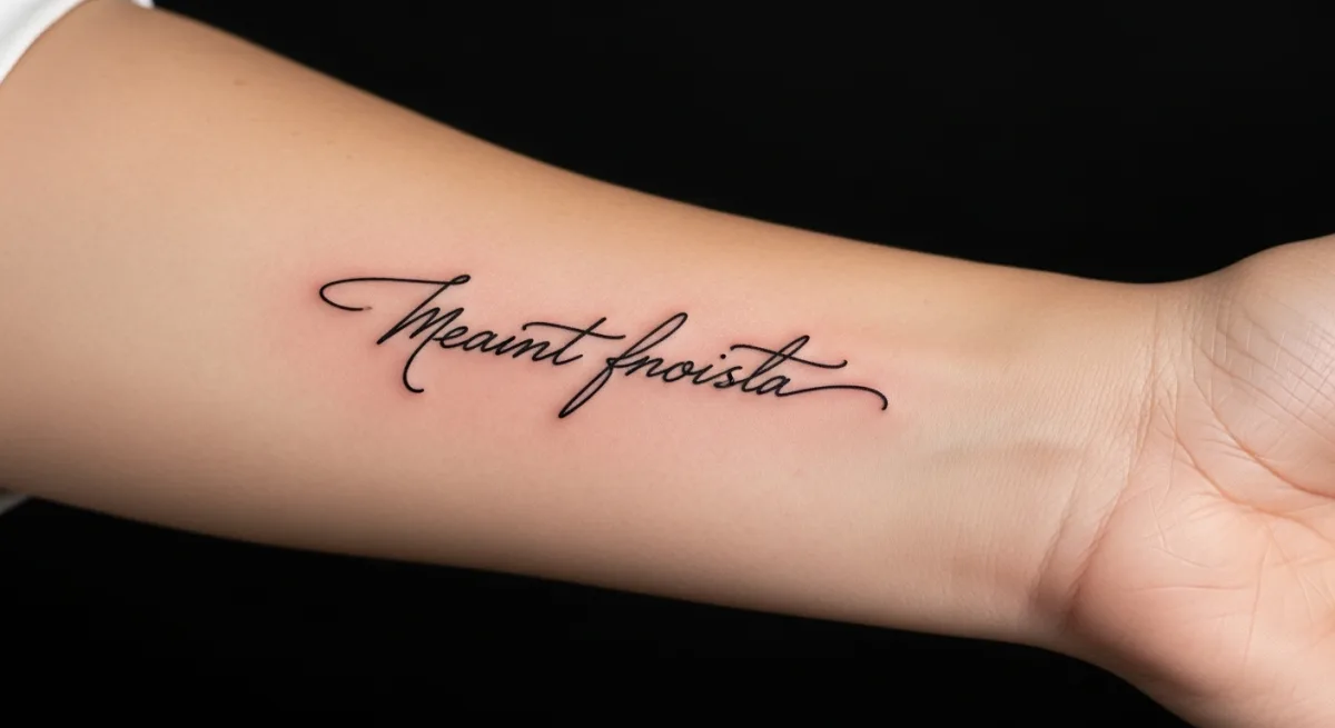
Lettering is the style that turns a word into an image. Far from simple printed typography, it is a design practice tailored for the skin, where each letter is hand-drawn and adapted to the body's curves. From angular gothic to slim chicano, from blackletter to modern calligraphic compositions, lettering is a universe of its own. It is also one of the most personal styles: behind every word lies an intention only the wearer truly knows. Animated with AI, it begins to breathe, to gently vibrate, as if the ink itself carried a voice.
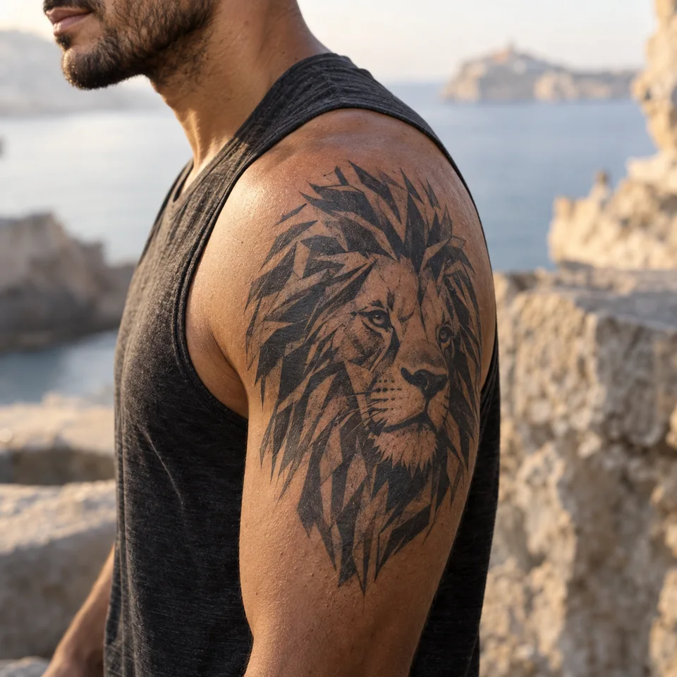
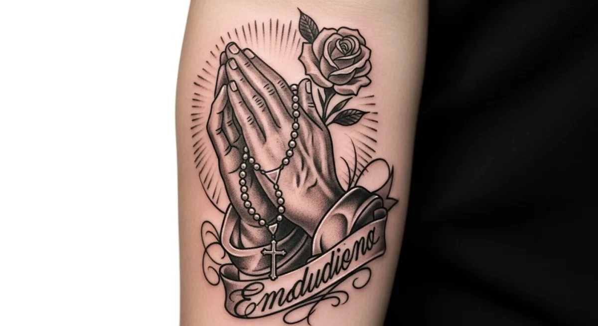
Examples of AI-generated animations
Demo animations generated with our tool — across all styles, to visualize the kind of motion that's possible.
Style characteristics
- Every letter drawn by hand, never simply printed
- Dominant families: blackletter, chicano, sailor, modern script, brush
- Composition adapted to body placement (forearm, collarbone, ribs)
- Contrasted thick and thin strokes that structure readability
- Often monochrome black, sometimes with grey shading or a red accent
- Readability comes first: an illegible lettering loses all meaning
Tips for animating this style
- Animate the word as a whole rather than letter by letter: legibility must stay intact
- A progressive writing effect (letters appearing) works well in short format
- Avoid rotation: a rotating word becomes unreadable
- A subtle pulse on the thick strokes makes the lettering vibrate without distortion
- For long loops, alternate two states (static / faint breath) rather than continuous motion
Frequently asked questions
Should I pick an existing font or custom lettering?
Custom lettering is always preferable. A printed font is not designed for skin or for healing blur: strokes that are too thin smudge within a few years. A professional letterer calibrates thick and thin strokes and spacing based on the placement and the required stroke weight. That is what separates true lettering from a typographic copy-paste.
Which words or phrases animate best?
Short words (1 to 3 words) produce the most impactful loops because the eye captures them in a fraction of a second. Long quotes work better with a progressive appearance effect. Avoid phrases in a foreign language you don't master: the AI has no awareness of meaning, and a badly written word stays badly written even when animated.
Does lettering age badly?
Not when properly sized. The trap with lettering is going too thin or too small: over time, ink spreads slightly and letters touch. The rule is at least 1 cm of height for lowercase letters and generous spacing. A solid lettering at the time of tattooing stays readable twenty years later.
Go further
- All tattoo styles: the complete visual guide — see where this style sits among the major families.
- The guide to AI tattoo animation — understand the technology behind these animations.
Ready to animate your own Lettering tattoo?
Try it with no account (3 variations), then get 1 free generation of 3 images when you sign up, no credit card required.
Create my animation →