Quote and phrase tattoos: personal words and layoutsChoose the words you want to keep close.
Explore phrase tattoos with personal words, a supportive message or an inscription in memory of someone. Choose the text first, then its length, reading direction and layout. The French examples can be adapted to your own words.
More about this selection
A phrase on one line, two lines or a curve reads differently. Keep punctuation that matters to you and try several line breaks. The lettering gallery then helps you choose letter shapes, from script to capitals.
Quote and phrase tattoos: personal words and layouts on skin
Light, medium and dark skin tones, different proportions and placements: compare how each motif sits on the body. These images are simulations created with our AI.
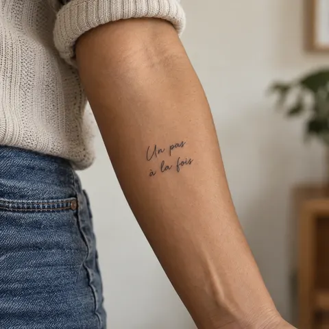
Un pas à la fois
The French phrase “Un pas à la fois” is arranged on two lines. Check every letter, accent and gap before choosing your version.
PersonaliseA few handwritten words
A short inscription keeps the message readable. Compare spacing before choosing the final size.
PersonaliseMemento Mori
Two words and one reading direction, built around contrast between the letters and the skin.
PersonaliseMore designs to explore
Try another direction: start with a line, a silhouette or a colour, then adapt the design in the studio.
“Un pas à la fois” in fine handwriting
Personalise“À mon rythme” in simple handwriting
Personalise“Ici et maintenant” in spaced small capitals
Personalise“Le cœur en chemin” in legible handwriting
PersonaliseThe words "Toujours avec moi" in fine handwriting across two lines
PersonaliseThe word Resilience in elegant script
PersonaliseTurn a reference into your own project
Write the phrase before choosing a font. Decide whether you want to read it yourself, share it or preserve a memory. Short wording may leave more space for letters, but should retain what you want to say. The examples are starting points to rewrite.
A phrase on one line, two lines or a curve reads differently. Keep punctuation that matters to you and try several line breaks. The lettering gallery then helps you choose letter shapes, from script to capitals.
Explore tattoo meanings →Three directions to compare
The main outline
Start with the outer shape. Choose what you want to keep before adding lettering or secondary elements.
Explore this direction →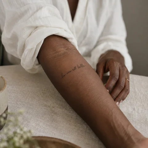
The contrast
Compare the dark lines with the open spaces. Ask your artist which details suit your intended size.
Explore this direction →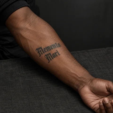
The placement
Look at the same reference at its actual size and from several angles. The placement is part of the composition.
Explore this direction →Where should your tattoo go?
Forearm
Compare the reading direction for you and for someone opposite. Test it with the arm relaxed.
Upper arm
Two short lines can organise text without stretching it around the arm.
Along the back
Compare vertical reading with a shorter layout. Do not shrink the letters just to force a phrase to fit.
Check the text before choosing the font
The exact message
Check meaning, grammar and accents. Keep the original document if the words come from someone close to you.
Line breaks
Compare several breaks on paper. Separating one word can change the rhythm or meaning.
The language
Have a translation checked by someone competent in that language. Attractive calligraphy does not guarantee correct wording.
Prepare your reference for the artist
Keep two or three references and note exactly what you want to retain from each. Specify placement, approximate dimensions and any existing tattoos nearby.
If the design includes letters or a date, prepare the exact text separately. AI images are starting points for discussion, not validated stencils or predictions of the final result.
More directions for your project
From the first design to your appointment
Clarify your reference
Keep a few images and explain what you like about each: the subject, linework, scale or placement. A reference starts a conversation; it is not a finished stencil.
Choose an artist for the style
Look at the artist’s own work, including healed examples where available. Discuss the intended dimensions, placement and any text before requesting a quote.
Check the final drawing
Review the stencil at its actual size and in several natural positions. Read names and dates character by character before approving them.
Prepare the appointment and aftercare
Ask your tattoo artist for preparation and aftercare instructions tailored to the session. The images here cannot determine what is suitable for your individual skin.
What if your next tattoo
started with your words?
Choose a direction, change a detail and create your own reference with Encre Vive.
Create my tattooView plans and creditsYour questions answered
01Which phrase should I choose?
Start with words you would use yourself or a precise memory. Read them in several contexts before choosing the layout.
02Can I use a loved one’s handwriting?
A clear document can serve as a reference. Ask your artist how to adapt its size and placement without losing its character.
03Is AI-generated lettering ready to tattoo?
No. Verify every letter, accent and punctuation mark, then have the final drawing prepared and checked with your artist.
04How do I personalise a reference?
Choose a model to open the generator with its subject and style. Change the description before generating and check any letters or numbers in the result.
05Are the tattoos in the photographs real?
The photographs are AI-generated simulations. Lettering studies show example layouts; all references need adapting with a tattoo artist.
06How much should I budget?
Ask an artist for a quote based on the dimensions, placement and detail of your project. The gallery cannot determine the cost of your session.